Week 11
Advanced Sass and CSS Filters
Mockups Due
Final project mockups are due before class!
Final Project: Starter Code
This GitHub Repository has some base starter code which you can use for the MTM6330-F18 final project.
Copy the entire contents into your project folder
Run
npm installin the terminal (in your project folder)Activate Gulp in watch mode by running the
gulpcommand in the terminal
Override Bootstrap variables
Remember in order to overrirde the default Bootstrap styling, you need to set the appropriate Sass variables at the top of your main.scss file. The starter code includes a couple of examples.
Suggested Structure
Keep everything that applies to multiple pages in the
main.scssfile.Create a Sass partial for styles that apply to only one page/layout. e.g.
_schedule.scsswould have the styles unique to theschedule.htmlpage.
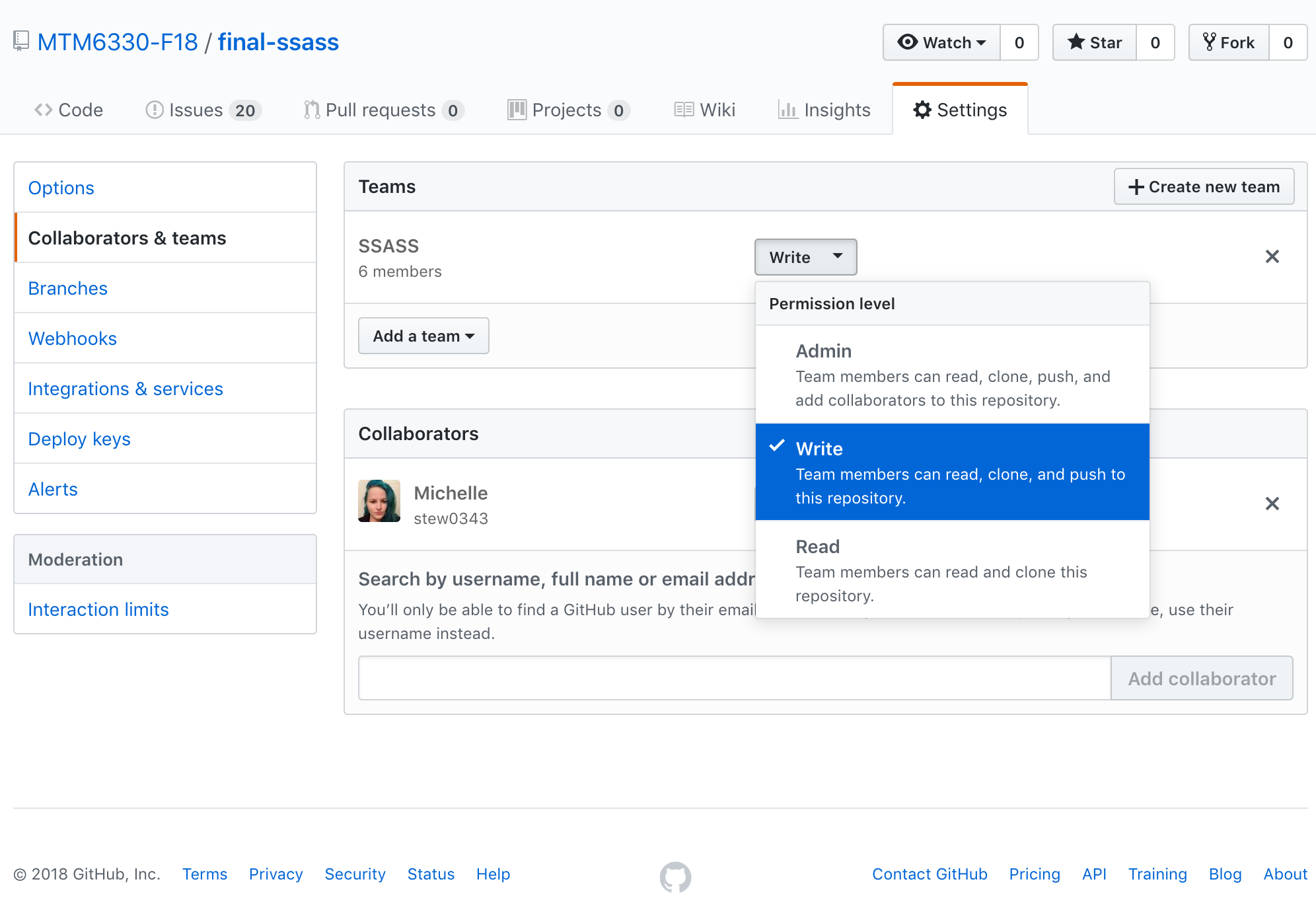
Team Permission
Team leaders need to ensure that their team members have write permission on the repository. Otherwise, they will not be able to upload their respective development branches.
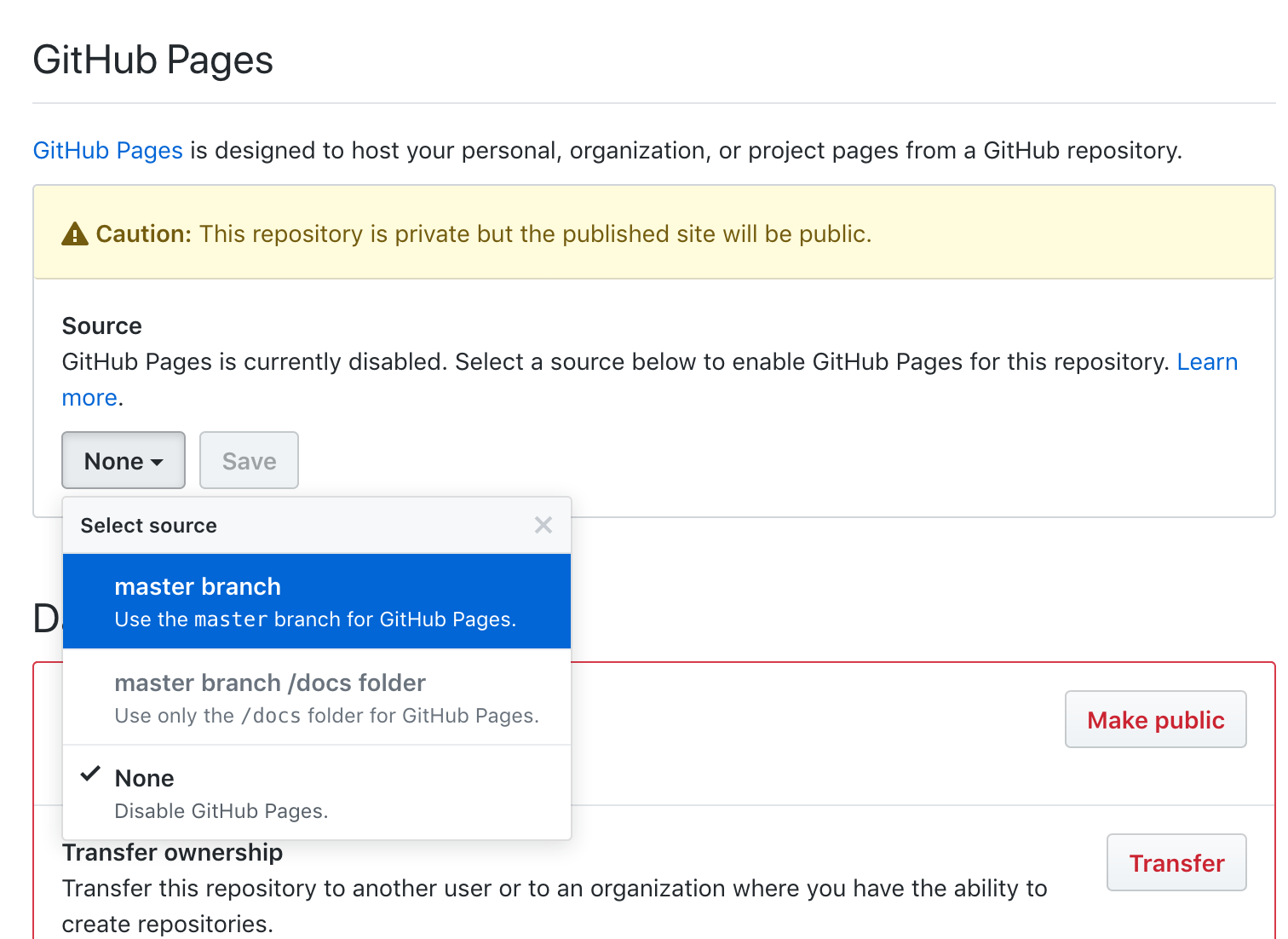
Dont't forget to activate GitHub Pages on your repository!
From your repository's settings page on GitHub, scroll down to the GitHub Pages section and select the master branch from the drop-down menu, and then click the [Save] button right next to it.
Bootstrap Sass Review
Add Bootstrap as NPM dependancy
If it is not already listed as a project dependancy in the package.json file ...
"dependencies": {
  "autoprefixer": "^9.1.5",
  "bootstrap": "^4.1.3",
  "cssnano": "^4.1.4",
  "gulp": "^3.9.1",
  "gulp-postcss": "^8.0.0",
  "gulp-sass": "^4.0.1",
  "jquery": "^3.3.1",
  "popper.js": "^1.14.4"
}
... then you can add it by running npm install in the terminal. Be sure that you are in the correct project folder.
npm install bootstrap
Import Bootstrap Sass
Near the top of main.scss file, we need to import the base Bootstrap theme.
@import '../node_modules/bootstrap/scss/bootstrap';
Override Variables
The entire Bootstrap CSS framework is built around an extensive set of Sass variables. We can easily customize the styling by overriding these variables. Since Bootstrap's variables are defined with the !default declaration we need to assign our override values before we import Bootstrap.
$primary: #006341; // set the primary color to AC Green
$jumbotron-bg: #e5efec; // set the Jumbotron background to AC Green @10% tint
$hr-border-color: #909390; // set the <hr> border colour to AC Charcoal @50% tint

// Load the main bootstrap framework.
@import '../node_modules/bootstrap/scss/bootstrap';
From the Sass official documentation
You can assign to variables if they aren’t already assigned by adding the !default flag to the end of the value. This means that if the variable has already been assigned to, it won’t be re-assigned, but if it doesn’t have a value yet, it will be given one.
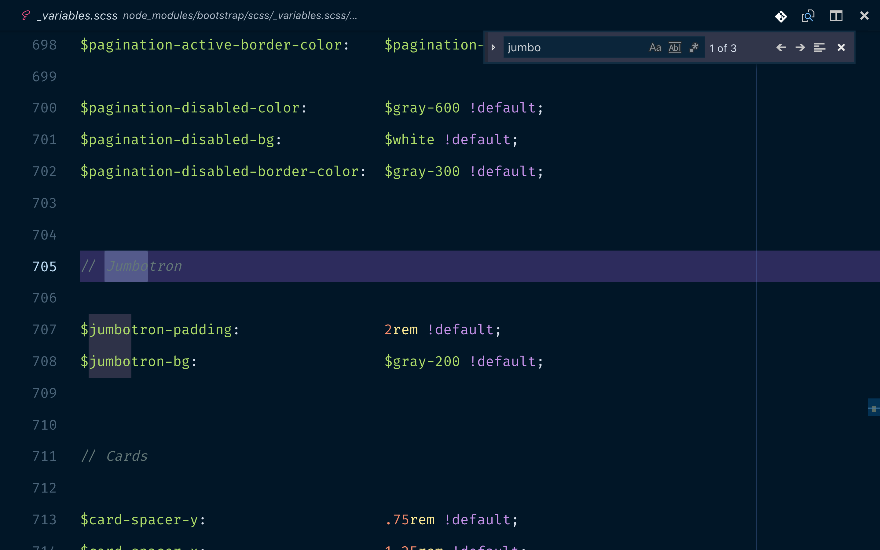
How to find the right variable
All of the Bootstrap variables are located in the node_modules/bootstrap/scss/_variables.scss file.
The variables should follow the $component-state-property-size formula for consistent naming. e.g. $nav-link-disabled-color and $modal-content-box-shadow-xs.
You should scan the whole file to get an idea of the extent of the available variables, but when looking for somthing specific, make use of the the document search function in VS Code (CMDf on macOS or CTLf on Windows) and search for the class name of the component that you want to override.
e.g. search for 'jumbo' to find the jumbotron related variables.
Core Sass Feature Review
- variables
- nesting
- referencing parent selectors with &
- partials
- colour functions
Advanced Sass Features
Mixins and Functions
Sass allows us to create custom extensions. Mixins insert repetive CSS statements into multiple style selectors. Functions retrun a single value.
@mixin
Define a mixin
@mixin clearfix {
  display: inline-block;
  &::after {
    content: '.';
    display: block;
    height: 0;
    clear: both;
    visibility: hidden;
  }
  * html & {
    height: 1px;
  }
}
Use the mixin
.some-div {
  @include clearfix;
  // other styles
}
@function
From the docs
... functions can access any globally defined variables as well as accept arguments just like a mixin. A function may have several statements contained within it, and you must call @return to set the return value of the function.
Let's say we need to calculate the width of a sidebar at 5 columns based on some other established global variables.
$grid-width: 40px;
$gutter-width: 10px;

@function grid-width($n) {
  @return $n * $grid-width + ($n - 1) * $gutter-width;
}

#sidebar {
  width: grid-width(5);
}
The compiled CSS would be
#sidebar {
  width: 240px;
}
Inheritance: @extend
Another way to include style details in multiple selectors is to use the @extend directive to inherit the properties of another class.
Base class
.button {
  border-radius: 0.25rem;
  display: inline-block;
  font-size: 1rem;
  height: 1.2rem;
  line-height: 1.2rem;
  text-transform: uppercase;
  text-align: center;
}
Extended classes
.button-small {
  @extend .button;
  font-size: 0.8rem;
  height: 1rem;
  line-height: 1rem;
}

.button-large {
  @extend .button;
  font-size: 1.2rem;
  height: 1.5rem;
  line-height: 1.5rem;
}
This compiles down to plain CSS as ...
.button,
.button-small,
.button-large {
  border-radius: 0.25rem;
  display: inline-block;
  font-size: 1rem;
  height: 1.1rem;
  line-height: 1.2rem;
  text-transform: uppercase;
  text-align: center;
}

.button-small {
  font-size: 0.8rem;
  height: 1rem;
  line-height: 1rem;
}

.button-large {
  font-size: 1.2rem;
  height: 1.5rem;
  line-height: 1.5rem;
}
Sometimes you want to be able to inherit the common styles but not actually use the base class in your markup. In these cases we can create the base class with a special prefix %. These are called placeholder selectors.
%button {
  // ... common styles
}
The final compiled CSS will now look like this ...
.button-small,
.button-large {
  // ... common styles
}

.button-small {
  // ... custom styles
}

.button-large {
  // ... custom styles
}
Notice that the .button class selector has been omitted from the final CSS.
Control Directives
- @if
- @for
- @each
- @while
Study Aid
Sass Essential Training video tutorial on Lynda.com
CSS Filters
CSS filters let you apply Photoshop like effects to images and SVGs directly in the browser, before they are rendered and visible to the user. In otherwords, no weird flickering images. The syntax is pretty simple: filter: <filterFunction> e.g. ...
.some-target-class {
  filter: grayscale(50%);
}
You can apply one or more of these functions:
- blur()
- brightness()
- contrast()
- drop-shadow()
- grayscale()
- hue-rotate()
- invert()
- opacity()
- saturate()
- sepia()
- url() - for applying SVG filters
Each of these functions takes an optional parameter, typically a percentage value. hue-rotate() takes value in degrees on the colour wheel.
Combine Filters
You can combine multiple filters to achieve a compound effect. Note that like in Photoshop the effects are applied sequentially like layers.
.some-target-class {
  filter: opacity(50%) blur(5px);
}
According to caniuse.com, the CSS filter property now enjoys more than 90% browser support and is safe to deploy in production sites. The full details on the capabilities and correct usage can of course be found on the MDN Documentation site.
Grid card examples for some of the above functions.
Hover over each card to trigger the effect.
Study Aid
For more examples read this great tutorial on CSS-Tricks
Frosted glass effect
This very classy overlay effect has long been accomplished with layerd images, but is now completely practical with pure CSS. This technique does require some minor CSS jujitsu to combine the effects of several CSS properties, but we will walk through it together.

In our example, we have an image with some text in an overlay.
Photo credit: NESA by Makers @ unsplash.com
The essential ingredients
HTML Markup
<div class="card">
  <div class="glass">
    <div>Your overlay</div>
    <div>content goes here</div>
  </div>
</div>
The Card Element
We begin by defining a card element. I am going to use some CSS custom properties (CSS Variables) to better illustrate where certain values need to be consistent in multiple places to make the illusion work. I have higlighted the most important lines below.
.card {
  --card-bg-img: url(./nesa-by-makers-701360-unsplash.jpg);
  --card-bg-colour: hsl(270, 50%, 40%);
  --card-height: 400px;
  background-color: var(--card-bg-colour);
  background-image: var(--card-bg-img);
  background-size: cover;
  border-radius: 0.5rem;
  box-shadow: 0 1px 3px 0px rgba(0, 0, 0, 0.23);
  height: var(--card-height);
  overflow: hidden;
  position: relative;
  width: 300px;
}
The Glass Element
We want the frosted glass effect to cover the bottom 80px of the card. This will be used as a positioning offset value for the transform property, but we need to make the height of our glass match the card.
We set the background-color to be white.
.glass {
  --cover-height: 80px;
  background-color: hsl(0, 0%, 100%);
  height: var(--card-height);
  overflow: hidden;
  position: relative;
  transform: translateY(calc(100% - var(--cover-height))) translateZ(0);
}
The magic
We will use a ::before psudo element which is the same size as the underlying card element and has the same background-image, but we will apply the blur and opacity filters to this one.
.glass::before {
  background-color: var(--card-bg-colour);
  background-image: var(--card-bg-img);
  background-size: cover;
  content: ' ';
  display: block;
  filter: blur(5px) opacity(0.28);
  height: 100%;
  position: absolute;
  transform: translateY(calc(-100% + var(--cover-height))) translateZ(0);
  width: 100%;
  z-index: -1;
}
The magic is in the positioning. The ::before element is absolutely positioned and sits above the white background of the .glass element, but below the actual text content of the .glass element.
Because we have sized and aligned it to match the full card, the background images line up. The overflow: none on the .glass element ensures that only the portion of the filtered image that intersects the visible portion of the .glass element is shown. The remainder of the original .card background image is unaffected.