Week 4
Sass :: variables, nesting and partials
TIP
Sassmeister is a Sass playground lets you test your Sass markup and see it instantly compiled. You can also save your work as a GitHub Gist.
We will talk about Sass variables, functions and nesting as we walk through a practical exercise.
Exercise 4-1: Navbar Example
Let look at how to implement a very common use-case, the top navbar with a logo and a menu. We will practice using CSS Flexbox with Sass variables, nesting and functions.
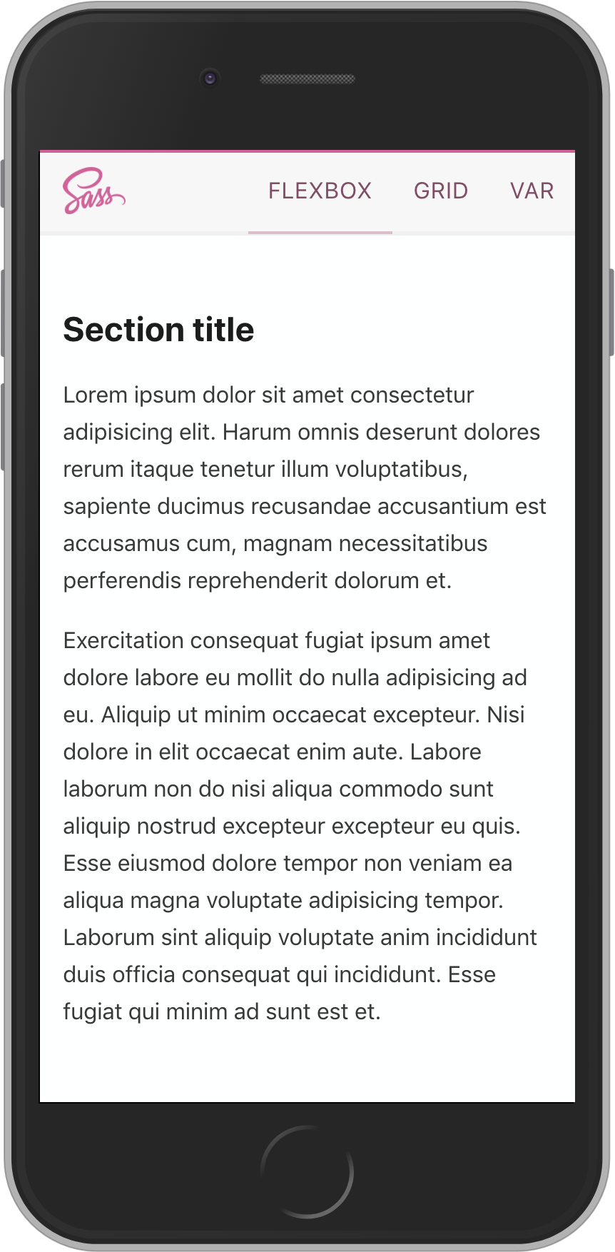
Our final solution should look like this.
Get starter repo from GitHub Classroom
- accept the GitHub Classroom assignment
- clone the repository to your local machine
- open the project folder in VS Code
TIP
If you have completed this section, you can skip down to the Sass --watch section. The next few steps just show how to build out the starter code from scratch.
Build the starter code from scratch
Initialize a new project folder
Lets start by creating a new project folder. Go to the folder where you are storing all of the projects for this course. In either terminal on macOS or git-bash on Windows ...
cd ~/Documents/mtm6330
Then use git to initialize a new project folder called week4, and change into that new project folder.
git init week4

cd week4
Open the week4 project folder in VS Code.
Create our source files
Create a new index.html file in the week4 project folder.
Create a new main.scss file in the week4 project folder.
Download the Sass logo and save it in the week4 project folder.
Scaffold the HTML markup
Use the built-in emmet short-cut ! to quickly scaffold out an HTML5 document in the index.html file and set the title property to Navbar Demo.
We also need to a link to our main.css file which doesn't exist yet, but will be created by the Sass compiler.
<!DOCTYPE html>
<html lang="en">
  <head>
    <meta charset="UTF-8" />
    <meta name="viewport" content="width=device-width, initial-scale=1.0" />
    <meta http-equiv="X-UA-Compatible" content="ie=edge" />
    <link rel="stylesheet" href="main.css" />
    <title>Navbar Demo</title>
  </head>
  <body></body>
</html>
TIP
See the emmet cheat-sheet for other short-cuts
Create the basic html structure for our navbar
<div class="navbar">
  <div class="logo"><img src="Sass-logo.png" alt="Sass" /></div>
  <nav class="nav">
    <div class="menu-item active">flexbox</div>
    <div class="menu-item">grid</div>
    <div class="menu-item">var</div>
  </nav>
</div>
Just for a little more complete visual feel to our demo, lets add a dummy article with some Lorem ipsum text underneath the navbar.
<article>
  <h2>Section title</h2>
  <p>
    Lorem ipsum dolor sit amet consectetur adipisicing elit. Harum omnis
    deserunt dolores rerum itaque tenetur illum voluptatibus, sapiente ducimus
    recusandae accusantium est accusamus cum, magnam necessitatibus perferendis
    reprehenderit dolorum et.
  </p>
  <p>
    Exercitation consequat fugiat ipsum amet dolore labore eu mollit do nulla
    adipisicing ad eu. Aliquip ut minim occaecat excepteur. Nisi dolore in elit
    occaecat enim aute. Labore laborum non do nisi aliqua commodo sunt aliquip
    nostrud excepteur excepteur eu quis. Esse eiusmod dolore tempor non veniam
    ea aliqua magna voluptate adipisicing tempor. Laborum sint aliquip voluptate
    anim incididunt duis officia consequat qui incididunt. Esse fugiat qui minim
    ad sunt est et.
  </p>
</article>
If you look at this in the browser right now it will not look the way we want it to be. So, lets add some styling.
Add styling to main.scss
Let's set the baseline values
html {
  box-sizing: border-box;
  font-size: 16px;
}

*,
*::before,
*::after {
  box-sizing: inherit;
}

body {
  background-color: #feffff;
  color: rgba(0, 0, 0, 0.78);
  font-family: system-ui, -apple-system, BlinkMacSystemFont, 'Segoe UI', 'Roboto',
    'Oxygen', 'Ubuntu', 'Cantarell', 'Fira Sans', 'Droid Sans', 'Helvetica Neue',
    sans-serif;
  font-size: 100%;
  line-height: 1.64rem;
  margin: 0;
  padding: 0;
}

h1,
h2,
h3,
h4,
h5,
h6 {
  color: rgba(0, 0, 0, 0.89);
}

article {
  padding: 2rem 1rem;
}
Sass --watch

Oops ... not that one ¯\_(ツ)_/¯
OK, we should put the Sass compiler into watch mode so that we can test the results of our changes in the browser as we work on the rest of the styling.
In the terminal for this project folder, run ...
sass --watch main.scss main.css
Add Flexbox
We want the whole navbar to be a horizontal flex container. Let's give it a fixed height of 60px and a light grey background colour, so that we can see it.
.navbar {
  background-color: hsl(0, 0%, 97%);
  display: flex;
  height: 60px;
}
I expect that the logo will wind up being larger than the menu item text. So, lets make sure they line up nicely. We can apply the align-items: center; property to vertically align the direct children of .navbar to the center.
.navbar {
  align-items: center;
  background-color: hsl(0, 0%, 97%);
  display: flex;
  height: 60px;
}
We want the logo to be in the left corner and the menu to fill the right half of the screen. We need to make the .logo and nav elements grow to fill half of the size of .navbar. Setting both of their flex-grow properties to 1 will do the trick.
We can take advantage of Sass nesting to make this easier to see.
.navbar {
  // ... other properties
  display: flex;

  .logo {
    flex-grow: 1;
  }
  .nav {
    flex-grow: 1;
  }
}
I think it is time to fix that logo, so that it does not take up the whole screen 😃.
.logo {
  flex-grow: 1;
  height: 100%;

  img {
    height: 100%;
    width: auto;
  }
}
WARNING
Don't forget to set the height on the .logo container. Otherwise it will inherit the full content height of the image rather than being limited to 100% of the parent .navbar element.
OK, lets fix the menu-items so that they are displayed horizontally rather than vertically. Again, we will use flexbox.
.nav {
  flex-grow: 1;
  display: flex;
  justify-content: space-between;
  align-items: center;
  height: 100%;
}
Menu styling
We have the basic positioning structure in place, but we still have some work to do in making it look nice. Lets start with the menu items. We will make them uppercase and center them in their segment of the menu.
TIP
When we apply all-caps to text it makes it easier to read if we also apply a little extra letter-spacing.
.navbar {
  // other properties ...

  .menu-item {
    flex-grow: 1;
    letter-spacing: 0.5px;
    text-align: center;
    text-transform: uppercase;
  }
}
Now lets add some background highlighting on hover and set the cursor to a pointer so that it looks clickable.
.menu-item {
  // other properties ...
  align-items: center;
  height: 100%;
  justify-content: center;

  &:hover {
    background-color: hsl(0, 0%, 94%);
    cursor: pointer;
  }
}
OK. Now lets add a border that matches the brand colour to highlight the active selection.
TIP
Set the border on all menu-items and then just set the colour on the active item. This prevents the sudden "jumping" caused by adding a border which changes the box size.
.menu-item {
  // ...
  border-bottom: 2px solid transparent;

  &.active {
    border-color: hsl(330, 55%, 60%);
  }
}
Not bad, but the highlighter looks a little detached. Lets add a shadow bottom-border on the whole navbar. Because of the way our eyes percieve colours on screen, we are going to make the shadow border just a little bigger than the highlighter.
.navbar {
  // ...
  border-bottom: 3px solid hsl(0, 0%, 94%);
}
Hmmm, the positioning is still off. Why? It is becuase of the way the height is calculated. We need to change it from 100% to an explicit pixel height to match .navbar. This is a good use-case for a variable.
Lets create a new variable called $height in the scope of the .navbar and then apply it to both the .navbar and the .menu-item.
.navbar {
  $height: 60px;

  height: $height;

  .menu-item {
    height: $height;
  }
}
Thats better. Now that logo needs some attention. We'll give it some left padding and shrink the size of the image a little to give it some white-space. We can use flexbox again to maintain the vertically centred position.
Lets use the CSS calc function so that the height of the <img> element is dynamic but maintains a consistent white-space of .75rem top and bottom.
.logo {
  align-items: center;
  display: flex;
  padding-left: 1rem;

  img {
    height: calc(100% - 1.5rem);
  }
}
That is better. But, I think the highlighter is taking too much attention. If we add a top border in the brand colour and then desaturate the highlighter we can strengthen the overall brand cohesiveness while allowing the eye to flow more naturally to the primary content.
We will use a psudo-element to control the positioning and ensure that our hover effect doesn't overlay the top border.
We will use two Sass functions to manipulate the brand colour and while we are at it lets set the brand colour as a variable since we are now going to use it in multiple places.
/* Global Sass variable */
$brand-color: hsl(330, 55%, 60%);

.navbar {
  &::before {
    content: ' ';
    border-top: 2px solid $brand-color;
    position: absolute;
    top: 0px;
    width: 100%;
  }
}
The lighten function increases the lightness of the given colour by the specified percentage.
The darken function decreases the lightness of the given colour by the specified percentage.
The desaturate function decreases the colour saturation of the level by the specified percentage.
Notice that we can wrap one function in another to get a compound effect.
.menu-item {
  color: darken(desaturate($brand-color, 30%), 20%);

  &.active {
    border-color: lighten(desaturate($brand-color, 30%), 20%);
  }
}
Notice there was one more change in the code above. We applied a darkend and desaturated version of the brand colour to the menu text to make it feel more tied to the overall branding.
Baseline Partial
There is at least one more improvement we could make by utilizing the Sass Partial feature. Lets remove everything above the /* Global Sass variables */ comment line and put it into a new file called _base.scss
/* Baseline reset */
html {
  box-sizing: border-box;
  font-size: 16px;
}

*,
*::before,
*::after {
  box-sizing: inherit;
}

body {
  background-color: #feffff;
  color: rgba(0, 0, 0, 0.78);
  font-family: system-ui, -apple-system, BlinkMacSystemFont, 'Segoe UI', 'Roboto',
    'Oxygen', 'Ubuntu', 'Cantarell', 'Fira Sans', 'Droid Sans', 'Helvetica Neue',
    sans-serif;
  font-size: 100%;
  line-height: 1.64rem;
  margin: 0;
  padding: 0;
}

h1,
h2,
h3,
h4,
h5,
h6 {
  color: rgba(0, 0, 0, 0.89);
}

article {
  padding: 2rem 1rem;
}
Then add a new line at the top of our remaining main.scss file
@import 'base';
Final main.scss
Your main.scss file should now look like this ...
@import 'base';

/* Global Sass variables */
$brand-color: hsl(330, 55%, 60%);

/* Add styles here */
.navbar {
  /* Class scoped Sass variable */
  $height: 60px;

  align-items: center;
  background-color: hsl(0, 0%, 97%);
  border-bottom: 3px solid hsl(0, 0%, 94%);
  display: flex;
  height: $height;

  &::before {
    content: ' ';
    border-top: 2px solid $brand-color;
    position: absolute;
    top: 0px;
    width: 100%;
  }

  .logo {
    align-items: center;
    display: flex;
    flex-grow: 1;
    height: 100%;
    padding-left: 1rem;

    img {
      height: calc(100% - 1.5rem);
      width: auto;
    }
  }

  .nav {
    display: flex;
    flex-grow: 1;
    justify-content: space-between;
    align-items: center;
    height: 100%;
  }

  .menu-item {
    align-items: center;
    border-bottom: 2px solid transparent;
    color: darken(desaturate($brand-color, 30%), 20%);
    display: flex;
    flex-grow: 1;
    height: $height;
    justify-content: center;
    letter-spacing: 0.5px;
    text-transform: uppercase;

    &:hover {
      background-color: hsl(0, 0%, 94%);
      cursor: pointer;
    }

    &.active {
      border-color: lighten(desaturate($brand-color, 30%), 20%);
    }
  }
}
Push to GitHub
- stage all changed files
- create a commit with the message, "Complete EX 4-1"
- push your commit(s) to GitHub
Submit
Copy the GitHub URL for your in-class exercise and paste it into the BS LMS assignment submission form for In-Class Exercise 4-1.